

GIRL FLU (2014)
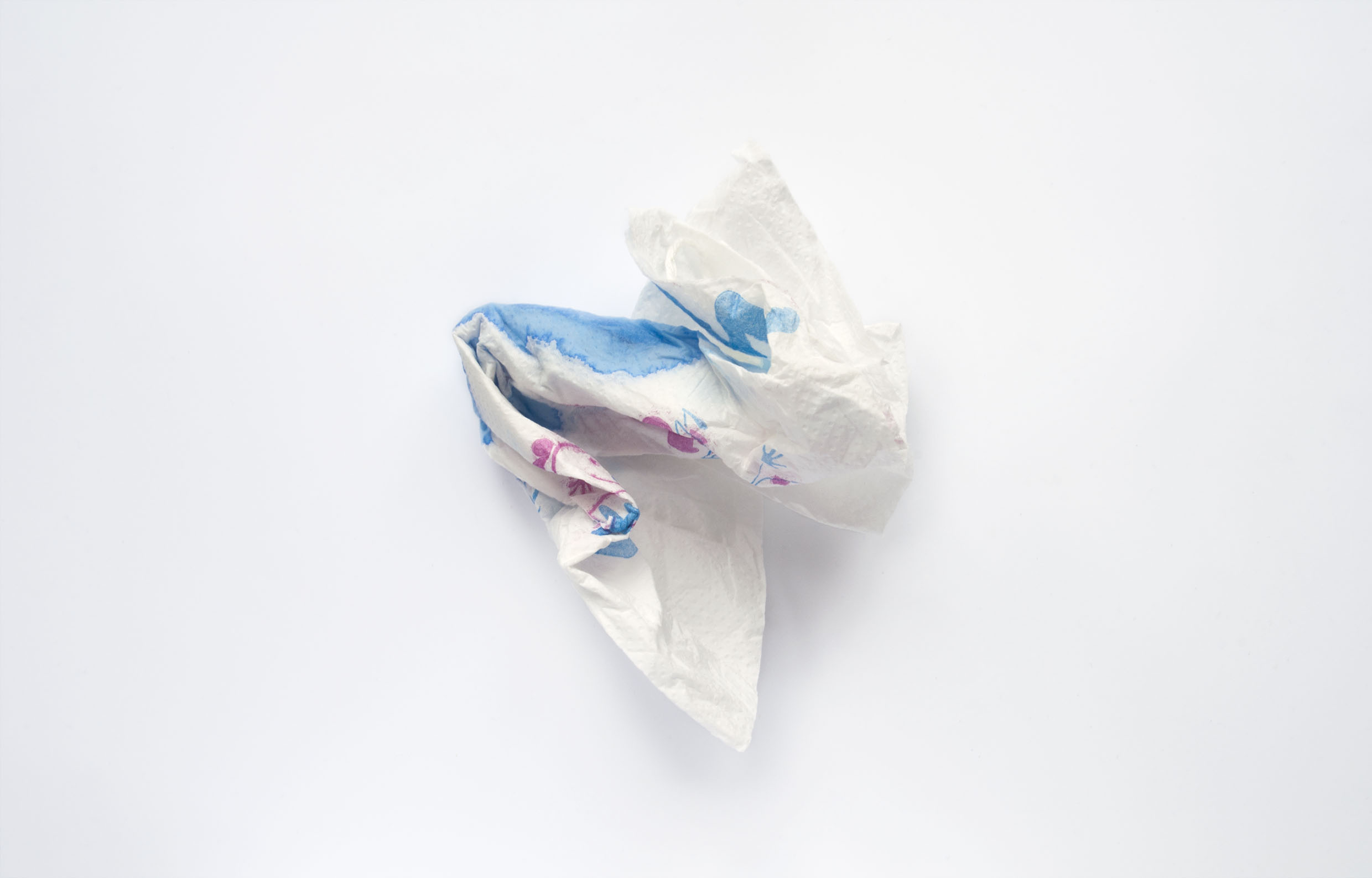
GIRL FLU (2014) focused on the shame around menstruation and explored the use of the colour blue in sanitary advertising. The images show sanitary products concealed by tissues and other materials. Although these items come with their own packaging to wrap after use, many abandon these bright and eye catching wrappers for softer, quieter and less noticeable tissues. The blue used is in reference to advertisements where blue is used to demonstrate the absorbing qualities of the product. The use of blue is also stereotypically associated with cishet men and within the heavily male advertising industry, so is a satirical comment on how this colour makes the subject easier to deal with rather than red which holds connotations of blood. The clinical nature of the colour adds to the connotations of sickness. The term ‘Girl Flu’ is a slang term for menstruation and also connotes the idea of being ‘sick with femaleness’. This term further highlights up the transphobic and trans-exclusionary nature of sanitary product advertisements.
Since this project, language around menstruation has changed and is even highlighted in my previous text above, when discussing inclusivity in language surrounding it. I want to keep the previous text describing the project as it reflects the context in which the work was made which is reflective of the social, cultural and popular discourses at the time. It also conveys my own progression, learning and growth as an artist but also how I viewed the body, gender and bleeding.